First of all, confrontations with the release!
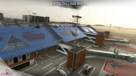
The airport is full of details, even close up, and I am really happy that you kept all the jetways free of statics (as you see it for yourself the topic is indeed devoid of any people complaining about them

)
This is a great improvement over XPlane and P3D version. Static aircraft also looks amazing and brings a lot of atmosphere into the airport. The actual chatter from EETN also adds a lot of immersion as well - even if a I am not the fan of the "kindergarten" style security announcement.

Now speaking of bugs.. One thing that I noticed very quickly is a crazy amount of the misspelt signs, and it's not even "A vs Ä" but some completely gibberish words that only makes sense because the others were spelt right. I do understand that making a lot of signs in a language that is not your own is complicated, and sometimes even the obvious things do get unnoticed. I did, however, refer to some of the mistakes when the project was still a WIP.. but only one of these mistakes got corrected. That being said I am still happy to assist you in correcting the signage (if you need so) - and pointing out every single mistake.
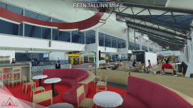
While the ground textures look well done overall the airport, in both winter and summer weather I noticed that the red markings right near the terminal look painfully bright, like the default ASOBO markings. I am not sure why is this left like that in the final version, but it is something that is very easy to correct in any image editing software. The tiles inside the terminal are also the wrong color, almost black, instead of the much lighter color. Again, something that I could correct were easily myself - and actually did.
The area adjacent to the VIP Terminal does lack some details. There should be 4 flag poles (currently there are only 3 flags flying. Estonia, the EU and Ukraine) and a small hill, that acts like a noise barrier.
The area near the ATC tower, could get some more attention. The 2 autogen houses there look like an eyesore.. I know there's a farm there, but maybe you could mask them a little bit so they won't stick out?
The night lighting looks well done, one thing that was more of a miss however, is the check-in area. In real life many wall signs there have a green bleed through light (active even during the day).
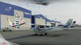
AI parking is generally as good as it gets, with the exceptions of ATR's that in real life are mostly parked near the main terminal , while there are always spawning next to the Magnetic MRO hangar.
The red&white smoke stack next to the Fahle House looks more unique in real life due to it being more shorter but also slightly wider than the other Tallinn's stacks. There, I suppose you just used the same model all over, but even if so, I think it should be also easy to correct the scale and XYZ coordinates without even making a custom model. The custom smoke from Iru PP looks nice, but the smoke coming from the cooling tower is slightly misplaced. Speaking of smoke stacks I am glad you added a stack at the location of the new PP, however, in real life there should be two stacks instead of one. I think the same smoke effect would also benefit there - as I see them smoking pretty much every time.
You could even add the another one in the opposite corner of the city, 59.349325911442875, 24.608451578644754 You can see it when approaching the runway 8.
I am happy that you listened to my request, and added the Muuga harbor (even if you did not add the custom grain elevator model). That being said it does feels a bit rushed (most of the cranes are still flat images and the fuel tanks are not there at all). But what bothers me the most (same about some of the city landmarks) is the terraforming, just a single rectangle, that leaves a really harsh transaction with the default mesh.
Speaking of ships, I'd remove the added cruise ships all together. Personally I am not really a fan of the huge boxy ASOBO ships - but again, it is my personal taste.

Would be also nice if you could improve the roof color of the Oleviste Church. In real life it has an iconic look thanks to its different shades of copper. Niguliste also could get some love, because currently the roof looks like it is hanging in the air due to the thin beams it is resting on.
If you are interested to perhaps also add some other landmarks in the future, Toompea Castle and Linnahall (with a heliport) would be my first obvious choices. Even more, because they were in all of the previous version of your package. Speaking of completely new landmarks I would go with the Lauluväljak (Song Festival Grounds, a must have landmark imo), Toomkirik, Pirita Klooster, Kadriorg or even Nõmme Lumepark (Good for VFR). There's also a new skyscraper being built in the city center.. so, who knows.
I know, I said previously that some parts of the airport look way too dated, but after taking another look in the released product I must say that it looks more-less up to date. one thing however that do look different is the wall at the arrivals hall. Today it got a more simplified aesthetics. You can see it here, from about 45:06 to 45:43
https://youtu.be/H62q7yluRxU?t=2706. Obviously, the ads, some interior details do change all the time, so it is impossible to keep up with everything. But if you are still interested in some more newer images - I'd be happy to take some pics (I am planning to update them anyway), if you are aiming for a more up to date look to make it look more tailored.
Ugh.. That was a long text to write (and of course to read through). I know, the home bias is strong with me...
So, this is only and only your choice how much and to what degree are you willing to change/bring things there. At least the fixing of the most obvious bugs can be prioritized quicker than the other things.